Designing Payment Flows That Help Users Build Credit, Not Destroy It
67% of Americans can't cover a $400 emergency—but traditional credit cards only offer one option when users struggle: miss payments and destroy credit. I designed Possible Finance's credit card payment system to break this cycle, creating an installment plan conversion feature that helped 3,000 pilot users maintain their credit scores during financial difficulty while achieving 89% customer satisfaction.
Key contributions:
Designed complete onboarding and payment setup flow encouraging healthy financial behaviors
Created installment plan conversion experience (unique product differentiator)
Established payment education and transparency patterns
Collaborated with PM and engineering to balance user needs with regulatory constraints
My Role & Approach
The Challenge
Possible Finance had a successful payday loan alternative, but wanted to expand with a credit card that would actually help users build credit, not destroy it. The key innovation: the ability to convert outstanding balances into installment plans, preventing missed payments and credit score damage when users face financial difficulty. I needed to design payment flows that make this complex financial product simple, transparent, and build healthy financial habits by default.
My Approach
As Senior Product Designer, I owned the payment flow experience end-to-end (onboarding, installment conversion, rescheduling) and collaborated with another designer to co-design the dashboard, ensuring seamless integration between payment initiation and ongoing management.
Designed the complete payment experience from approval through ongoing management:
Payment setup and autopay configuration
Installment plan conversion flows (unique product differentiator)
Payment rescheduling and modification
Education and transparency patterns
Collaborated with PM to define flexible payment requirements, balancing user needs with regulatory constraints and business objectives
Established design patterns for financial education, transparency, and user control that extended beyond payment flows to become company standards
Validated through a pilot program, gathering feedback from 3,000 customers to refine the experience before broader rollout
Payment Experience
Onboarding (Setting Up for Success)
The first interaction sets the tone for the entire relationship. I designed the onboarding to celebrate, educate, and establish healthy defaults.
Key Design Decisions
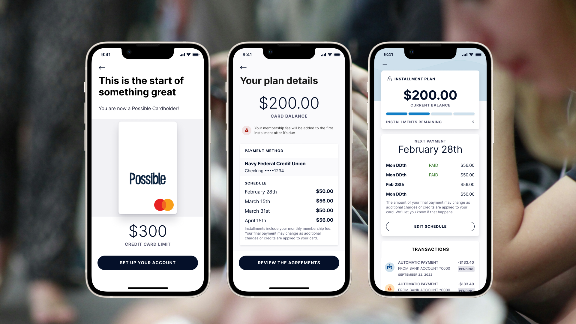
Celebrate the approval: The "This is the start of something great" screen frames approval positively. Users see their $300 credit limit with a visual card mockup, making the opportunity tangible and exciting rather than transactional.
Educate upfront: Rather than assuming financial literacy, the "How payments work" screen breaks down the payment cycle into 4 clear steps with icons:
Your payment will be automatically paid
Your payment will show as scheduled
Your payment clears 2-3 business days after
Your balance will update showing new amount
Why this matters: Preventing confusion is cheaper than handling support tickets. Users who understand the system make better decisions.
Encourage healthy defaults
The autopay setup screen makes autopay the default path, not an optional toggle. This is a critical design decision.
Key elements
Clear heading: "Set up autopay"
Explanation of frequency: "Your full balance will be withdrawn from the connected account on a bi-weekly basis"
Connected account clearly shown: Navy Federal Credit Union Checking ••••1234 in a prominent card
Membership fee transparency: Warning with icon explaining "Your Possible Card membership fee for the current month will be charged as soon as you accept the card agreements"
Upcoming autopayments listed: Wednesday December 15th, Friday December 30th, Friday January 14th (shows three upcoming payment dates)
Primary action: "REVIEW THE AGREEMENTS" button
Escape hatch: Small text at bottom: "If autopay doesn't work for you, contact us for alternatives" with "Contact us" link
Design principle
Autopay is the default, not optional. This isn't a toggle users can skip. The design makes the healthy choice the primary path while still offering an alternative for those who truly need it.
Why default autopay matters
On-time payments are critical for building credit
Users who set up autopay are less likely to miss payments
Bi-weekly schedule aligns with common paycheck timing
Showing three upcoming dates builds trust and sets expectations
Transparency through design
Connected bank account shown clearly with last 4 digits
Membership fee called out explicitly before user commits
Three upcoming payment dates visible (not just "next payment")
Alternative contact option at bottom for edge cases
Installment Plan Conversion
The Problem
Traditional credit cards have one option when you're struggling financially: miss payments and damage your credit, or somehow find money you don't have.
The Solution
When users face financial difficulty, they can:
Pause new charges on the card
Convert the outstanding balance into fixed installment payments
Maintain their credit score by continuing on-time payments through the plan
This is what sets Possible Card apart from other credit cards on the market.
Why this matters
67% of Americans can't cover a $400 emergency. This feature provides a safety net that actually helps users, not penalizes them.
The Conversion Flow
I designed the conversion to be fast and frictionless. Users who need help shouldn't have to jump through hoops.
Step 1: Educate first
Before converting their balance, users see exactly how the installment plan works.
Three key messages with icons:
Your card will be locked - Don't forget to update any automatic payments using your card
You pay your full balance over 4 payments - Any pending charges or credits applied to the last payment, with flexible dates up to a 31-day grace period
Once your balance is paid your card is ready to use again - After final payment is processed
Design principle
Users need to understand the trade-offs (locked card, 4-payment structure, grace period) before making this decision. Education reduces buyer's remorse and support burden.
Step 2: Review the complete plan
The plan details screen shows everything users need to know before committing. Dates are automatically set starting from the next payment date - there’s no date selection required.
Key elements
Card balance prominently displayed: $200.00
Membership fee notice with warning icon: "Your membership fee will be added to the first installment after it's due"
Payment method confirmation: Navy Federal Credit Union Checking ••••1234
Complete schedule showing 4 payments:
February 28th: $50.00
March 15th: $56.00
March 31st: $50.00
April 15th: $56.00
Transparency note: "Installments include your monthly membership fee. Your final payment may change as additional charges or credits are applied to your card."
Primary action: "Review the agreements"
Why auto-schedule works
Removes decision paralysis - users don't have to pick dates
Starts immediately from next payment due date
Maintains payment rhythm they're already expecting
Users can edit dates later if needed
Design principle
Make the default path the easiest path. Users in financial stress don't need more decisions - they need immediate relief with sensible defaults.
Step 3: Informed consent
The agreements modal ensures informed consent through progressive commitment.
Design decisions
Modal overlay focuses attention
Close button (X) in the top right allows exit
Scrollable terms text
Explicit checkbox: "I understand and accept the terms of the installment plan agreement above."
Slide-to-agree interaction (not just a button tap)
Action requires both the checkbox AND slide completion
Why progressive commitment
Combining a checkbox with slide-to-agree makes accidental acceptance nearly impossible while still being frictionless for users who've read and understood the terms.
Making the feature discoverable
The dashboard serves as the ongoing home for payment management. When users need flexibility, the installment plan conversion is right where they need it.
Key design decisions
Prominent but not pushy: The "PAY OVER TIME" button sits below the current balance and standard payment options (Pay Now, Edit Autopay). It's clearly visible for users who need it, but it doesn't feel like we're pushing users toward debt conversion when they don't need it.
Context-appropriate placement: Users see their current balance first ($200.00), understand their payment status (next payment February 28th), and then have the flexibility option available. The button appears in a natural spot in the information hierarchy.
Clear labeling: "PAY OVER TIME" immediately communicates what the feature does without financial jargon like "installment plan conversion" or "hardship program." The language is simple and benefit-focused.
Design principle
The best safety net is one you can find when you need it. The feature needed to be discoverable without feeling like a trap or penalty.
Step 4: Confirmation and peace of mind
The confirmation screen provides closure and sets clear expectations.
Key elements
Celebratory illustration (calendar with coins) reinforces positive action
Specific payment amount: $50.00
Exact start date: "Monday, February 28th"
Payment frequency stated: "Will be paid every two weeks"
Important deadline notice: "You can change or cancel this payment until 7:30pm PST on October 14th. It may take up to 4 days for your available balance to refresh."
Simple "OK" button to dismiss
Design principle
Financial decisions are stressful. Confirmation screens should reduce anxiety by clearly stating:
What just happened ($50.00 bi-weekly starting February 28th)
When it takes effect (immediately, but 4 days for balance refresh)
How to undo it (cancel by October 14th at 7:30 pm PST)
Preventing confusion
When users have an active installment plan, their card is locked to prevent new charges. If they forget and try to use the card, they receive an immediate SMS notification.
Key design decisions
Proactive communication
Rather than leaving users confused about a declined transaction, the system sends an immediate text message explaining why the card was declined and what they can do about it.
Clear, actionable messaging
States the situation clearly: "Your Possible Card is paused"
Explains why: "unavailable for purchases until you complete your repayment plan"
Provides action: "Tap the link..." to review plan details
Reduces support burden
This single notification prevents countless "why was my card declined?" support tickets. Users get their answer immediately, with a path to see their payment schedule.
Design principle
Anticipate moments of confusion and provide answers before users have to ask. A declined transaction is stressful - immediate context reduces anxiety and maintains trust.
Ongoing Plan Management
Once users have an active installment plan, they need the ability to adjust it when life changes.
Showing progress and providing control
The dashboard transforms once a plan is active, showing users where they are and giving them control to adjust if needed.
Key elements
"INSTALLMENT PLAN" header with lock icon (reminder card is locked)
Current balance: $200.00
Progress indicator: "Installments remaining: 2"
Next payment prominently displayed: February 28th
Payment history showing completed payments marked "PAID"
Upcoming payments with dates and amounts
"EDIT SCHEDULE" button for making changes
Transparency note about final payment adjustments
Design principle
An active plan isn't a trap. Users should always know where they stand and have clear paths to make adjustments if their circumstances change.
Rescheduling when needed
Users can edit individual payment dates through a simple calendar interface.
Design decisions
Month/year navigation with arrows
Full calendar grid showing available dates
Selected date highlighted (28th)
Clear note below calendar: "Your payment is due on or before Month DDth"
"Save change" button to confirm
Why allow editing
Financial situations change. Paychecks get delayed. Unexpected expenses happen. Giving users control to reschedule prevents missed payments.
Guided decisions
Warning states help users understand the implications of their date choices without being patronizing.
Two levels of guidance
Level 1 - Soft warning: "That date is a little far away"
Message: "This won't impact your credit score but will negatively impact your ability to borrow from Possible Finance in the future."
Primary action: "I understand"
Secondary action: "Pick a different date"
Level 2 - Strong recommendation: "That date is pretty far away"
Message: "If you want to pay on this day, your credit score and ability to reloan with us will be negatively impacted. To select this date anyway, you'll need to contact us."
Recommendation: "We recommend selecting a date that's nearer if possible."
Primary action: "Pick a date that's nearer"
Secondary action: "Contact us"
Design principle
Guide users toward healthy choices while respecting their autonomy. The first warning allows them to proceed with understanding. The second requires contact, creating a speed bump for potentially harmful decisions while still offering the option through human conversation.
Reschedule confirmation
When users modify their payment schedule, they receive clear confirmation.
Key elements
Celebratory illustration (calendar with coins)
Heading: "Your payment has been rescheduled"
Specific amount rescheduled: "$50.00"
New date: "Monday, February 28th"
Two clear next actions:
Primary: "Back to dashboard"
Secondary: "Reschedule another"
Design principle
Every action gets clear confirmation. Even schedule changes need acknowledgment to reduce user anxiety about whether the change "took."
Design Principles
Through this work, I established four key principles for Possible's payment experiences
Financial Transparency
Every screen shows exactly what users are committing to. Amounts, dates, terms, and fees are always visible. No hidden surprises.
Examples in practice
Membership fees called out with warning icons before commitment
Complete payment schedules shown with specific dates and amounts
Final payment adjustment possibility explained upfront
Cancellation deadlines stated clearly
Healthy Defaults
Autopay isn't buried in settings. It's encouraged as the primary path. Good design can guide users toward behaviors that benefit them (on-time payments build credit).
Examples in practice
Autopay is the default onboarding path, not optional
Bi-weekly payments align with common paycheck timing
Installment plan auto-schedules from next payment date (no decision paralysis)
Warning system guides users toward nearer payment dates
Progressive commitment (checkbox + slide) prevents accidental acceptance
Education Through Design
Rather than assuming financial literacy, educational screens build understanding before users make decisions. Preventing mistakes is better than handling their consequences.
Examples in practice
"How autopay works" explains the 4-step cycle before users commit
"How Pay Over Time works" covers card locking, payment structure, and grace period
Warning modals explain credit score implications of date choices
Proactive notifications prevent confusion when card is paused
Empathy in Crisis
The installment plan exists for when users struggle financially. The design treats this moment with dignity, presenting it as a tool for staying on track, not a penalty for failure.
Examples in practice
Feature is called "Pay Over Time" not "Hardship Program"
Dashboard entry is a clear button, not buried in settings
Education explains benefits (maintaining credit) not just constraints (locked card)
Grace period of 31 days provides genuine flexibility
Warning messages are informative, not judgmental
SMS notifications explain declined transactions without shame
Impact
The goal was to design a credit card payment experience that helped users build credit rather than destroy it — making healthy financial behaviors the default while providing genuine flexibility when life gets difficult.
Results
3,000 customer pilot validated the payment experience
89% customer satisfaction rate with card dashboard and payment flows
Installment plan conversion confirmed as a key product differentiator
Shipped to production
User outcomes
Installment plan gave users a genuine alternative to missed payments during financial hardship, protecting credit scores
Default autopay and transparent scheduling encouraged on-time payment behavior
Upfront education reduced confusion about payment mechanics and card locking
Proactive SMS notifications prevented anxiety around declined transactions
Strategic outcomes
Positioned Possible as a customer-first financial services provider in a market where most credit cards penalise users for struggling
Established reusable payment flow patterns and design system components for future products
Proved the flexible payment model works within regulatory compliance