Unicorn Design System
When I joined WP Engine as one of three product designers, our design system was holding us back. As the team grew, the cracks became impossible to ignore: designers detached components because states were missing, engineers built without a shared library, and new hires struggled without documentation.
I led the effort to rebuild Unicorn, not just creating better components, but fundamentally changing how we scaled design across the organisation. The result was a comprehensive, accessible design system with embedded documentation that became the foundation for all WP Engine product experiences.
My Role & Approach
I led the end-to-end consolidation effort, managing two contributing designers while maintaining my own component work. With no formal design pipeline in place, I built the infrastructure for the team to work effectively from the start:
Team leadership: managing two designers, running regular syncs, and providing design feedback
Concurrent releases: pushing for design and development to ship components simultaneously, reducing drift between spec and implementation
Stakeholder communication: Trello board and automated Slack updates so everyone knew component status without having to ask
Cross-functional collaboration: triad setup with engineering and product partners throughout
Understanding the Problem
Visual Audit & Research
Before designing anything, I needed to understand the current state of both the system and the people using it. I partnered with another designer to audit the existing User Portal, documenting every button, header, colour, and interaction pattern to identify inconsistencies and prioritise where to focus first.
We then ran a survey with designers and developers, followed by moderated interviews to understand where the system was breaking down in practice.
“Part of the issue lies within the fact that not everyone knows where the Unicorn components are. So we have different implementations of similar components all over the place.”
“It’s missing core components, resulting in designers bending or breaking components. The expectation that you need to use Unicorn is not widely shared across product teams.”
“I would hope that it would be very obvious for all developers, exactly where you get your components and exactly what options are available to you.”
These weren't edge case complaints. They pointed to a system that had outgrown itself, and gave us a clear brief: make the system discoverable, complete, and trustworthy enough that teams would actually use it.
Atomic Design at Scale
Foundation First
The design foundations existed in parts, but were inconsistently applied and poorly communicated. My first task was surfacing what was there, identifying gaps, and establishing a clear, documented set of standards that the whole team could reference: a typography system with clear hierarchy, a colour palette built to WCAG AA compliance with accessibility ratings called out on every swatch, a consistent 8px spacing scale, and accessibility guidelines embedded throughout rather than treated as an afterthought.
Making foundations explicit before rebuilding components was a deliberate sequencing decision. Without that shared reference point, two designers working on different components would make different calls on the same problem.
Component Development
With foundations documented and agreed, I took an atomic approach to component development. In practice, product priorities shaped the sequencing — navigation came first despite being an organism-level component, which meant working up and down the atomic hierarchy simultaneously rather than strictly bottom-up. It created an early win that built momentum and stakeholder confidence, while the atomic foundations continued to develop in parallel.
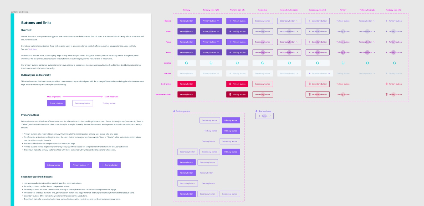
From there, I prioritised areas where improvements would have the biggest impact: buttons, text inputs and dropdowns, selection controls, messaging and feedback patterns, and progression and steppers.
Each component was built using Figma's auto layout and variants to consolidate states and ensure consistency across interactions.
Documentation Where Designers Actually Work
One thing became clear early on: designers weren't reading documentation in Confluence. It was out of date and not actively used by the design team in any other context.
The solution was to meet designers where they already were. I embedded usage guidelines directly within the Figma library file, so documentation was always one click away from the component itself. Updates happened in one place as components evolved, and designers kept the library open as a natural part of their workflow rather than a separate reference tool.
For developers, I worked with the front-end team to integrate Storybook with a Figma add-on, allowing engineers to toggle between design guidelines and React components in the same view. We also leveraged ESLint to flag code quality issues before commit, giving engineers a systemic check rather than relying on manual review.
Each component included usage guidance and best practices, anatomy breakdowns with labelled parts, dos and don'ts with visual examples, accessibility requirements, and links to the corresponding Storybook implementation.
Accessibility by Design
Accessibility is often retrofitted onto components that were never built with it in mind. I made WCAG 2.1 AA compliance a core requirement from the start, shaping decisions at every level: colour combinations tested for contrast ratios, focus states visible for keyboard navigation, semantic structure in component naming, and screen reader considerations documented at the component level.
The colour system was built to WCAG AA compliance from the ground up, with accessibility ratings called out on every swatch against the default background.
I also made accessibility a shared responsibility, reviewing contributors' work, directing them to relevant resources, and advocating for it in broader design reviews where it might otherwise have been deprioritised.
Managing the Transition
The Deprecation Challenge
Migrating from old components to new variants presented a specific challenge in Figma: deleting a component defaults every instance to the last saved version rather than removing it, creating zombie components that are invisible in complex designs and difficult to detect at scale.
I developed a deprecation strategy that maintained backward compatibility while clearly signalling the path forward. Deprecated components got visual indicators in Notes pink, a translucent striped pattern that was immediately recognisable without being disruptive. Layer naming was updated with [DEPRECATED] labels. Critically, components were only marked deprecated after the new version had shipped to Storybook, so designers were never left without an alternative.
This approach meant designers working in legacy areas of the Portal could always tell what was current and what wasn't, without needing to ask.
Scaling Through Contribution
A design system led by a small core team will always be a bottleneck. Long-term success meant enabling the broader design team to contribute without fragmenting the system or lowering the quality bar.
I developed a contribution framework covering the full process: guidelines outlining when to contribute versus when to use existing patterns, a proposal template for suggesting new components or modifications, a walkthrough guide documenting the end-to-end process from design to Storybook, and a governance model with clear approval workflows and design QA checkpoints.
The goal was to make contributing feel like a natural extension of design work rather than a separate process with a steep learning curve.
Impact & Outcomes
Unicorn shipped as the foundation for all WP Engine product experiences, with 100% of identified components migrated to the new system and 35% of the front-end transitioned to React within the project timeframe.
Results
Reduced design inconsistency across the User Portal through standardised components
Improved accessibility with WCAG 2.1 AA compliance built into every component
Eliminated tribal knowledge dependency by making guidelines accessible in designers' primary workflow
Scaled design team effectively through comprehensive documentation and contribution models
Team Benefits
Designers onboarded faster with documentation embedded directly in Figma
Engineers implemented designs with greater accuracy and consistency
Product managers gained confidence in design scalability
QA cycles shortened due to standardised component behaviour